“The workers they come back from their day in the field..”
The second of my 2019 Phish summer tour prints! For Phish’s 2 performances at Bonnaroo, I created a print inspired by the Dürer woodcut titled “Not Following Good Advice”, which he created for the Book of Fools (1498). I had the song “Jennifer Dances” in my mind when choosing this image for this print.
Prints are 9 x12 on 11×14 paper, and printed with Supergraphic black ink by Bill Fick. Black and white editions are printed on 140 lb watercolor paper, and the color variants are printed on 98 lb mixed media paper. Black and white are an edition of 30, and 2 color variants: yellow/red edition of 20, and a red/purple edition of 3. Prints are now available in my shop: www.joseeen.etsy.com
Albrecht Dürer – ‘VIII-not following good advice’-woodcut
I excited to finally present the first of my 2019 Phish summer tour prints! Continuing on the theme started by my Riviera Maya block print, I was inspired by the work of 15th century printmaker Albrecht Dürer. I had been studying his work, as he was an early influence in my printmaking journey, and found many prints that I felt would lend themselves well as tour prints. I started working on the blocks in January, and at this point have carved 8 of 13 blocks for the entirely of summer tour. I recently moved to a better (and larger!) living space, which means I no longer need to carve and print in the living room/kitchen! The move has delayed my work a bit, but as I get settled, I’ll be printing and carving the rest shortly!
For the tour opener in St. Louis, Missouri, I created a print inspired by the Dürer woodcut titled “Gerson” (1489). Jean Charlier de Gerson was Chancellor of the University of Paris, who was forced to flee Paris after being suspected of leaning toward reform in the late 1300s. This print was also inspired by the song “Ginseng Sullivan”, thus the ginseng instead of the unknown plant in the original, which can be seen in the bottom left corner of the print. Although the song references the North Georgia hills, I was happy to find out that ginseng does grow in Missouri! You can also spot the Chaifetz Arena in the background, as well as the iconic St. Louis Gateway Arch.
Prints are 9 x12 on 11×14 paper, and printed with Supergraphic black ink by Bill Fick. Black and white editions are printed on 140 lb watercolor paper, and the color variants are printed on 98 lb mixed media paper. I haven’t decided on the exact edition size, but these summer prints will be a much smaller edition than last year’s. Prints will be available in my Etsy shop this Friday (5/10/19) around 6 pm eastern. Expect more summer tour prints to be made available soon after!
“Gerson” Albrecht Durer (1489)
Prints are 9×12 on 11×14 paper, and printed with Supergraphic black ink by Bill Fick. Black and white editions are printed on 140 lb watercolor paper, and the color variants are printed on 98 lb mixed media paper. I haven’t decided on the exact edition size, but these summer prints will be a much smaller edition than last year’s. Prints will be available in my Etsy shop this Friday (5/10/19) around 6 pm eastern. Expect more summer tour prints to be made available soon after!
EDIT 5/19: After a long delay, my prints are finally available in my shop! The recent weather in my area (lots of rain) caused my prints to take forever to dry, one of the downsides of oil based ink.
The 11th and final print in my summer tour series. Inspired by the Swedish poster for “The Invisible Boy” (1957) by Boheim/Werle. This was tricky to finish up, with the craziness of Camden, Merriweather, Curveball (RIP), and starting back up at school. Being a teacher gives me the summer to focus on prints, but this one was right in the middle of a busy time of year. I was stuck on a idea, and ended up bailing on a couple. My search for the right poster led me to foreign posters for American movies, and eventually I found some Swedish made posters. The work I found were amazing, inspired themselves from the American movie posters. This print was a different style than what I had done all summer, and required some different processes. The images were drawn and inked, then scanned. Certain parts of the images were drawn and colored digitally to match the original, and the background was watercolor and acrylic. The final image then digitally arranged. Prints are 13×19 on cardstock, signed and limited to an edition of 150. Prints are currently available for sale in my shop: www.joseeen.etsy.com
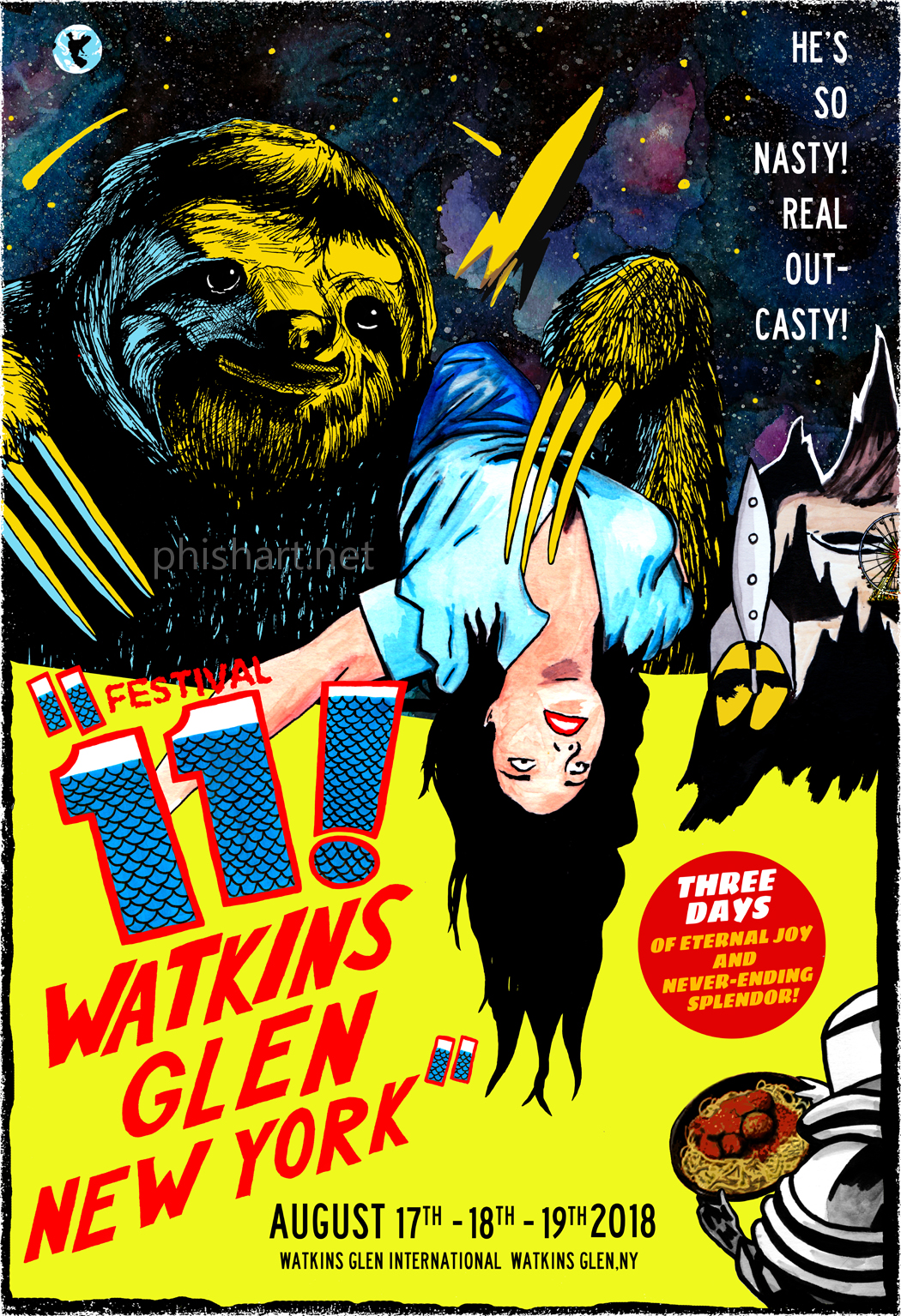
The 10th print in my summer tour series. Inspired by the Spanish poster for “It! Terror From Beyond Space” (1958). This was the toughest print for me to create. This one took me the longest to create, apart from the pressure of making it a good one (it felt like a lot of people were waiting for this one). I had almost finished it up when I decided to start over and create a new version. Lots of time was spend painting sloth fur, as well as even more time fixing it digitally. Being self taught, I’m pretty sure there’s an easier way to do all the things I do in Photoshop! As always, the images are all drawn, inked and watercolored, then scanned and digitally arranged. Prints are 13×19 on cardstock, signed and limited to an edition of 150. Prints are currently available for sale in my shop: www.joseeen.etsy.com , and will be available on lot before the shows.
The 7th print in my summer tour series. This was the poster I was most excited for, because its a hometown show (although I’d rather be at the Mann!) and I felt it captures the feel of Camden. The print is based off the poster for “Werewolves on Wheels” (1971). The lack of background allowed me to take more time in recreating the main image, which I created using brush and ink. This was one of my biggest challenges, and I tried to keep it true to the original, although I did make some changes (Trey’s guitar, a telephone, the Rhombus, Biker Trey) As always, the images are all drawn, inked and watercolored, then scanned and digitally arranged. Prints are 13×19 on cardstock, signed and limited to an edition of 150. Prints are currently available for sale in my shop: www.joseeen.etsy.com , and will be available on lot before the shows.
The fifth print in my summer tour series. For the Austin show I was inspired by the poster for The Giant Gila Monster (1959). This was a simple one, basically a recreation of the original poster that I hand drew and colored. I used lyrics from Shafty, since they were similar to the poster quote (“Only Hell could could breed such an enormous beast!”) Prints are 13×19 on cardstock, signed and limited to an edition of 150. Prints are currently available for sale in my shop: www.joseeen.etsy.com , and prints will be available on lot before the show.
The third print in my Summer tour series. For the Bill Graham Auditorium show in San Francisco, I created a print inspired by the posters for Reptilicus (1961) by Reynold Brown, which takes place in San Francisco, as well as The Beast from 20,000 Fathoms (1953), artist unknown. As I continued this series, I felt more comfortable altering things, in this case, replacing the monster from the Reptilicus poster with the monster from Beast from 20,000 Fathoms, which I felt better fit the use of the Lizards lyrics. The print was hand drawn in sections, then inked and watercolored to create the complete image. They were later scanned, and digitally arranged to create a version that is true to the original poster. Prints are 13×19 on cardstock, signed and limited to an edition of 150. Prints are currently available for sale in my shop: www.joseeen.etsy.com , and prints will be available on lot before the show.
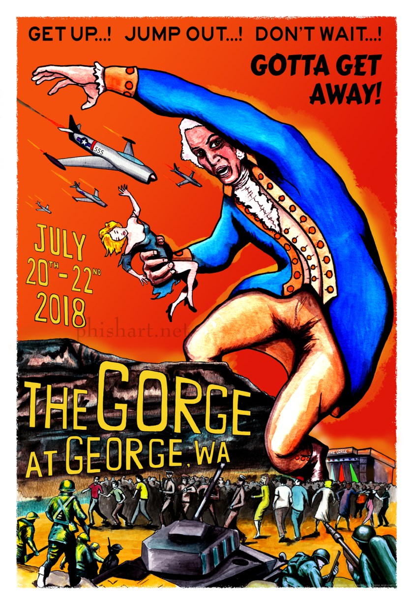
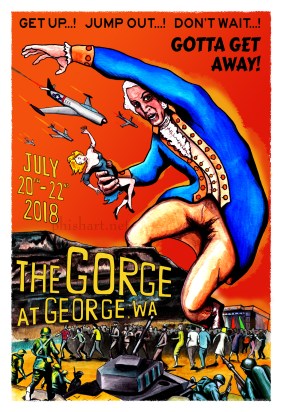
The second print in my summer tour series. For the Gorge shows, I decided to create an homage to the poster for “The Amazing Colossal Man” ( 1957) which was illustrated by Albert Kallis . In place of the colossal man, I opted for George Washington, since it definitely seem appropriate for a show taking place in George, WA. Using photos of Washington’s actual uniform, I recreated the original poster, adding the actual Gorge background, as well as the stage. The print was hand drawn in sections, then inked and watercolored to create the complete image. They were later scanned, and digitally arranged to create a version that is true to the original poster. This was originally the only poster to not contain Phish lyrics, but as I created more posters (which included lyrics), it seemed like the odd man out. After many suggestions from others, as well as lots of researching, I finally decided on lyrics from 555. Oddly enough one of the planes has 555 on it, so it seemed fitting that I ended up using lyrics from that song!
Prints are 13×19 on cardstock, and limited to a signed edition of 150. I currently have a small presale going on in my shop ( www.joseeen.etsy.com ) , I will have prints available at the Gorge as well (although I won’t be there).
I’ve been busy the last couple months working on my upcoming series for Phish summer tour! After a break last year, I decided to create a poster for every stop on the tour (similar to what I did in 2016). This year I’m working around a theme of vintage monster/sci-fi movie posters. Using posters that I felt were a fit for each venue, I recreated the posters by hand drawing, inking, and painting the images, which were then scanned and digitally arranged. The earlier posters were drawn to be as close to the original, as the series evolved and I became more comfortable with the style, I took more liberties with the images. I’ve been working on these since February, and many have been completed, so I’m happy to finally release them as we get closer to summer tour!
Prints will be available through me on lot at MPP and Camden, (hopefully Curveball as well!), and will possibly be available at other shows I don’t attend. I will also have them in my Etsy shop in the next couple weeks, as well as my streamlined shop that’s strictly devoted to this series: www.phishart.com. In celebration of this series, I will also be doing a small presale for the first print today (6/2) at Noon!
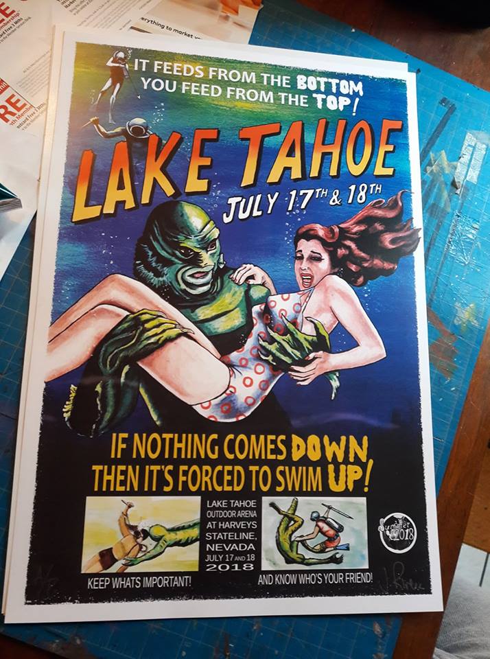
Lake Tahoe
The first in my series, This print was inspired by the poster for the Creature From the Black Lagoon (1954), illustrated by Reynold Brown, who created many of the iconic movie posters of the 50s and 60s. I kept gravitating to his work while researching, and ended up recreating or being inspired by quite a few of them.
The images were all hand drawn, inked (pens and brush) and painted with watercolor. I then scanned them to create a digital painting of sorts. The prints are 13×19 on cardstock, signed and limited to an edition of 150. They will be available for purchase in mid-June through my shop, and a small presale will be happening on June 2nd at noon. I will be posting more prints shortly, and be sure to follow me on Instagram or Twitter for sale announcements as well as work in progress shots!
This show was webcast for free via Live Phish. Birds of a Feather contained a The Birds quote. The Wedge contained a Stash tease. Down With Disease was unfinished.


 - Copy")